 how-to
How to Design Professional Signage for Events
Last Updated: October 23, 2026
Quick Summary
How to design professional signage for events starts with clear, concise copy paired with readable fonts and high-contrast colors. Plan signs around the attendee journey, choose durable materials, maintain brand consistency, and provide detailed specifications to your printer for best results.
- Use simple words and remove unnecessary text so attendees understand your message in three seconds
- Choose sans-serif fonts like Helvetica or Arial that remain readable from a distance
- Apply high-contrast colors like black text on white or dark blue on cream for maximum readability
- Map your venue and place directional signs at decision points where attendees might go the wrong way
- Select durable materials like vinyl or corrugated plastic for events lasting multiple days or outdoor conditions
Table of Contents
- Start with Clear, Concise Copy for Your Event Signage
- Professional Sign Design Tips for Maximum Impact
- Event Signage Ideas: Guide Attendees Through Your Venue
- Event Sign Materials: Durability and Weather Resistance
- Event Banner Design and Brand Consistency
- Plan Signage Placement and Quantity by Attendee Journey
- Production Specifications and Design Handoff
- Frequently Asked Questions
Start with Clear, Concise Copy for Your Event Signage
Learning how to design professional signage for events means understanding that words matter as much as design itself. Attendees will glance at your signs for just a few seconds. That means every word needs to pull its weight.
Keep your message short. Use simple words. Avoid jargon or long sentences. A sign that says "Registration" beats one that says "Attendee Check-In and Credential Distribution." People understand the first one instantly.
Remove anything unnecessary. If a sign doesn't help attendees or promote your brand, cut it. Each word should answer one of these questions: Where do I go? What happens here? What's the offer?
Test your copy by reading it aloud. Does it sound natural? Can someone understand it in three seconds? If not, simplify further.
Professional Sign Design Tips for Maximum Impact
Good design makes your message stick. It also makes your event feel organized and professional. The best event signage combines clear hierarchy, readable fonts, and colors that pop.
Start with one dominant element. This might be your logo, a headline, or a directional arrow. Make it bigger than everything else. Then add supporting details in smaller type. This visual hierarchy guides the eye naturally.
Avoid cramming too much onto one sign. White space isn't wasted space. It makes your message easier to read and your design more polished.
Choose Fonts That Work at a Distance
Your font choice determines whether people can read your sign from across a room. Not all fonts work for signage. Some look great on a screen but fail when printed large.
Sans-serif fonts are your best choice for event signage. These are fonts without the small lines at the ends of letters. They're cleaner and easier to read from a distance.
Avoid decorative or script fonts for main messages. Save those for small accents only, like a tagline. They're beautiful at small sizes but become hard to read when blown up.
Test your font at the actual size and distance where it will appear. If your sign will hang 20 feet away, print a sample and view it from that distance.
A common mistake is choosing a font because it looks nice on a computer screen. The screen is close to your face. Your event attendees will be much farther away. Distance changes everything.
Apply High-Contrast Colors and Visual Hierarchy
Color contrast is what makes text readable. High contrast means your text color and background color are very different. Dark text on a light background works. Light text on a dark background works.
Black text on white is the safest choice for readability. But it can feel plain. If you want more personality, try dark blue on cream, or dark green on light gray.
Avoid color combinations that look good to you but fail in real life. Red text on green might seem festive, but people with color blindness may not see the difference.
Use color strategically. Highlight important information with a color that stands out. If your event has a brand color, use it for accents, not for text.
Test your colors in the actual lighting where the sign will appear. A color that pops under bright office lights might disappear under dim event lighting.
Event Signage Ideas: Guide Attendees Through Your Venue
The best event signage guides people without them having to ask for help. Think about the attendee's journey. They arrive. They look for registration. They find the main conference room. They discover breakout sessions. They locate refreshments. They find the exit.
Each of these moments is a chance for a sign to help. Understanding how to design professional signage for events means mapping out these moments and creating signs for each one.
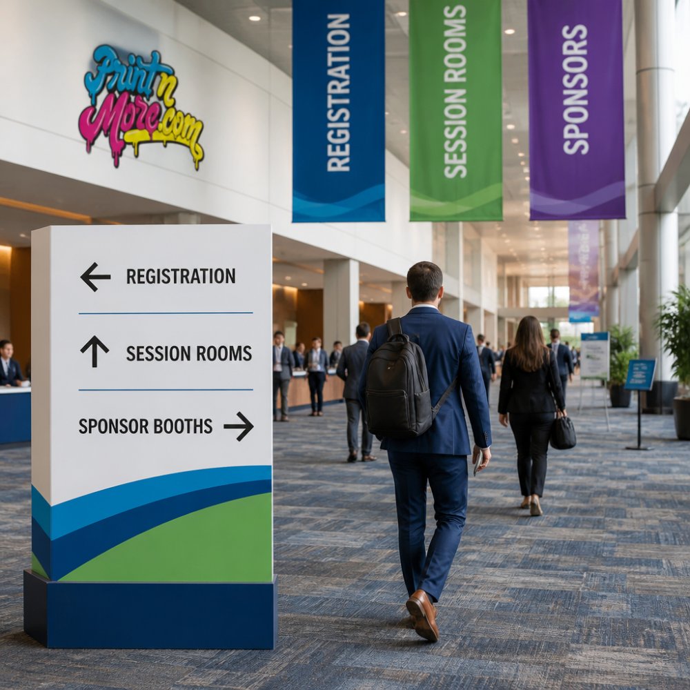
Directional Signs and Wayfinding
Directional signs answer one question: Which way do I go? They should be simple. An arrow pointing left. A room number. That's often all you need.
Place directional signs at decision points. These are spots where attendees might go the wrong way. The entrance to your venue. Hallway intersections. Stairwells. Elevators.
Make arrows big and obvious. A small arrow won't be noticed. A large arrow is hard to miss. Use arrows that point clearly in one direction. Avoid diagonal arrows or curved arrows. People understand straight lines instantly.
Color-code your wayfinding if your event is large. Different colored signs for different areas. Keynote sessions in blue. Breakout rooms in green. Vendor hall in orange. This helps people navigate faster.
Wayfinding signage reduces confusion. It makes your event feel organized. It also frees up your staff to help with real problems instead of giving directions.
Entrance, Registration, and Branded Displays
Your entrance sign is the first impression. Make it count. It should be visible from far away. It should feature your event name and logo. It should feel welcoming.
Registration signs should be impossible to miss. Use your largest font here. Use your brightest color. People arriving at your event will look for registration first. Make it obvious.
Branded displays reinforce your event identity. These might include your event logo, sponsor logos, or key messaging. Position them in high-traffic areas. Use them to create photo opportunities. When attendees take photos, they share your branding on social media.
Keep your design consistent across all signs. Same font. Same color scheme. Same logo placement. This consistency makes your event look polished and professional.
Event Sign Materials: Durability and Weather Resistance
The material you choose determines how long your signs last and how they perform in different conditions. For outdoor events, durability matters more. For indoor events, you have more flexibility.
Vinyl is a popular choice for event signage. It's durable. It resists fading. It can handle moisture. Vinyl signs can be used for multiple events if you store them properly.
Foam board is lightweight and affordable. It works well for indoor events. But it's not weather-resistant. Rain will damage foam board. Wind can bend it.
Corrugated plastic is another durable option. It's lighter than vinyl but tougher than foam board. It resists moisture and fading.
Paper signs are budget-friendly but fragile. They work for short indoor events only. They won't survive humidity or outdoor conditions.
Think about how you'll store your signs after the event. Will you reuse them next year? If so, choose durable materials.
Event Banner Design and Brand Consistency
Event banners are your biggest visual elements. They set the tone for your entire venue. Make them count.
Your banners should feature your event name, date, and logo prominently. Include your main brand colors. Keep the design clean. Too many graphics or colors will make your banner look cluttered.
If you have multiple sponsors, create a separate banner for sponsors rather than cramming logos onto your main banner. This keeps your primary branding clean and professional.
Use the same fonts and colors across all your banners. This consistency signals that your event is well-organized. Mismatched banners look amateur.
Position banners where they'll be visible in photos. The entrance is ideal. Above the registration table. Behind the speaker stage. When attendees photograph your event, your branding appears in their pictures.
PRINTnMORE has produced event banners for conferences, trade shows, and festivals.
Plan Signage Placement and Quantity by Attendee Journey
Before you design a single sign, map out your venue. Mark the key points where attendees will need guidance. This is where your signs go.
Draw your floor plan. Mark the entrance. Mark registration. Mark each session room. Mark bathrooms. Mark food and beverage areas. Mark exits.
Now think like an attendee. You arrive at the entrance. What sign do you need to see? "Check In Here" or "Registration." You finish registration. What's next?
Count how many signs you actually need. Many event planners over-order signs. They end up with extras they never use. Others under-order and run out. Plan carefully.
For a small conference, you might need 10 to 15 signs. For a large trade show, you might need 50 or more.
Consider sight lines. A sign that's blocked by a pillar is useless. A sign at eye level is easier to read than one above people's heads.
Production Specifications and Design Handoff
When you hand off your design to a printer, clarity matters. Vague instructions lead to mistakes.
Provide measurements in inches. Specify the exact width and height of each sign. Include bleed area if applicable.
State your color requirements. Are you using Pantone colors? CMYK? RGB? Different color systems produce different results.
Specify the material. Vinyl 13 oz? Foam board 3/16 inch? Corrugated plastic? The printer needs to know.
Include a deadline. When do you need the signs? Rush orders cost more. Plan ahead when possible.
Provide high-resolution files. Low-resolution images will print blurry. Use 300 DPI for print.
When you work with PRINTnMORE, we'll review your specifications and ask clarifying questions if needed.
Designing professional signage for events takes planning, but the payoff is clear. Good signage makes your event run smoothly.
Start with clear, simple copy. Choose readable fonts and high-contrast colors. Plan your signs around the attendee journey.
When you're ready to bring your event signage to life, PRINTnMORE is here to help. We handle everything from design consultation to fast turnaround printing.
Frequently Asked Questions
How do I create event signage that's readable from a distance?
Use a minimum letter height of 1 inch per 10 feet of viewing distance, and increase that by 30-50% for outdoor events. Choose sans-serif fonts like Arial or Helvetica for clarity. Test your design by viewing it from the farthest point attendees will see it. High-contrast colors (dark text on light backgrounds or vice versa) improve readability significantly. Avoid thin fonts or small caps, which become illegible at distance.
What materials work best for professional event signage?
Choose materials based on your event duration and environment. Vinyl banners offer durability and weather resistance for outdoor or multi-day events. Foam board and corrugated plastic work well for indoor conferences and are lightweight for setup. For permanent installations or high-traffic areas, consider rigid substrates like dibond or PVC. All professional event sign materials should resist fading, tearing, and moisture damage. Discuss material options with your printer to match your budget and event timeline.
How do I ensure brand colors stay consistent across all printed event signs?
Provide your printer with color specifications in CMYK format (for print) along with Pantone or PMS color codes for exact matching. Share your brand guidelines document, including approved logos and color palettes. Request a color proof before full production runs. Work with a printer who offers color-managed workflows. PRINTnMORE's 28+ years of experience includes managing color consistency across large event campaigns.
What should I include on directional and wayfinding signs at events?
Keep directional signage simple: use arrows, short destination names, and distance or time estimates when helpful. Include room numbers, building names, or section letters. Use consistent arrow styles and placement throughout your venue. For large events, create a visual hierarchy where main directional signs are larger and more prominent than secondary wayfinding. Test your directional system with a small group before the full event to identify confusing areas and adjust placement accordingly.